

What goodies will you find in Spark?
Check out the highlights below, or cruise on over for a full preview on Sketch Cloud.
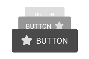
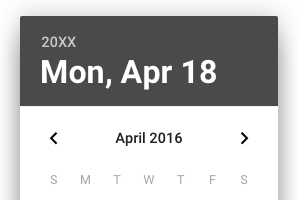
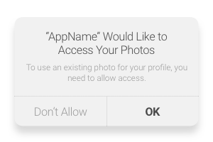
Device-agnostic components, like buttons, modals, accordions, popovers and more.
UI components for Android apps based on Material design.
UI components for Apple Devices based on iOS 11/12 SDK.

Commonly used charts like bar, radial and line for quick insert.

All of the basic form field items. States and icons within fields are customizable.
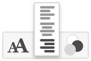
Preset font styles in white, gray and black, as well as all three alignments.
A subset of Font Awesome 5.0 icons in vector format, listed alphabetically.
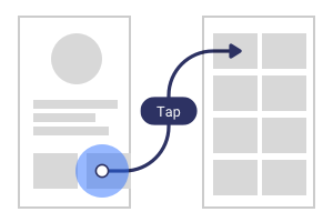
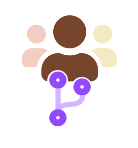
Responsive symbols to create user flows and documentation.
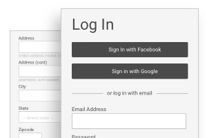
Prepackaged form templates for common cases, like login and address collection.
Spark includes a few other resources by permission to round this out as a complete kit. Thanks to the following authors for partnering with us to deliver the library: